Introducing Nova Suite’s New Logo & Brand Identity
We’re excited to share something big with you today: Nova Suite has a new look.
Our brand has always been f innovation, creativity, and making powerful tools accessible. But as Nova Suite has grown, we realized our old illustrated identity, while fun and recognizable, no longer fully represented who we are today. It started to feel a little dated and didn’t scale as well across all the different platforms, products, and experiences we now support.
That’s why we’ve reimagined the Nova Suite brand from the ground up.
A Logo for the Future
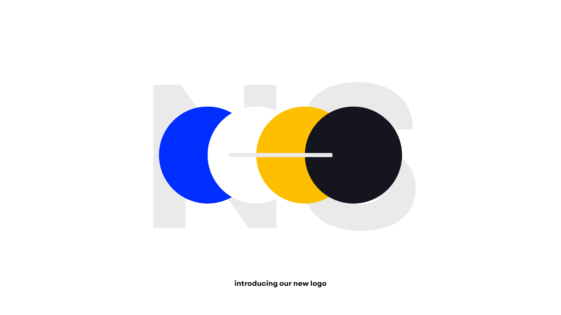
The new logo reflects our shift to something cleaner, sharper, and more timeless. It’s simple enough to work anywhere, but strong enough to stand on its own.
A Refined Color Palette
We’ve also streamlined our color palette to something more muted, elegant, and consistent. Nova Suite is about clarity and focus, and our new palette reflects that. Expect to see cleaner visuals, less noise, and more harmony across every app and experience.
The Switch to Garet
One of the most noticeable changes is our typography. Nova Suite no longer uses Space Grotesk or Jakarta Sans. Instead, we’ve fully embraced Garet, a typeface that feels modern, approachable, and adaptable. It works beautifully across both UI and brand materials, giving Nova Suite a single, unified voice in how we write and present ourselves.
Why This Matters
This isn’t just a visual refresh. It’s a statement about where Nova Suite is headed. Our new identity reflects maturity, clarity, and focus, while still leaving space for creativity and innovation. It’s designed to last, and to grow with us as Nova Suite continues to expand.
We can’t wait for you to see the new logo, colors, and typeface across all our apps and platforms starting today.
This is the new Nova Suite. Cleaner. Stronger. Ready for the future.